Plot your data using gnuplot
System statistics are hard interpolate since usually they are collected in large quantities and sometimes represents large numbers. Recently I was doing a prototype and wanted to measure how much damage it would to the main project (in terms of performance); so used performance counter feature in the processor to measure some events(cache miss, memory read etc) with and without my code change. But after looking at the numbers I realized it is difficult to analyze such a data. Because each number is 8 digit and I had 16 columns(16 cpu) and 100 rows of data(100 seconds of run). So I decided to use some graph so that it would be easy to understand the data.
Googled for a GNU graph tool and found gnu plot – this blog is to show how good it is and how easy it is to use. Consider using it if you have lot of numbers. For this post I took some sample data from my ubuntu machine while running stress command.
[codegroup]
[shell tab=’output’]
cat stat.txt
procs ———–memory———- —swap– —–io—- -system– —-cpu—-
r b swpd free buff cache si so bi bo in cs us sy id wa
0 0 251124 1827388 4720 32704 6 34 19 38 42 74 1 0 98 1
0 0 251124 1827388 4720 32708 0 0 0 0 104 71 0 0 100 0
13 3 251108 1349912 4728 322540 4 0 4 20 683 1789 42 12 47 0
11 3 251008 1382620 4728 322520 180 0 180 0 1604 1233 89 12 0 0
11 3 251008 1432052 4728 322520 0 0 0 0 1361 1237 90 10 0 0
11 3 251008 1298352 4728 322668 0 0 0 0 1392 1275 90 10 0 0
2 3 251008 1512576 4728 323524 0 0 0 0 20077 14827 59 16 13 12
0 0 251008 1826388 4728 32756 0 0 0 0 45069 25566 0 4 25 71
0 0 251008 1826444 4728 32708 0 0 0 0 59 46 0 0 100 0
…
[/shell]
[shell tab=’stress’]
stress –cpu 8 –io 4 –vm 2 –vm-bytes 128M –hdd 2 –timeout 200s
[/shell]
[shell tab=’vmstat’]
sudo vmstat -n 1 200 > stat.txt
[/shell]
[/codegroup]
The following example shows how to create line graph for us, sy columns in the above against time(seconds).
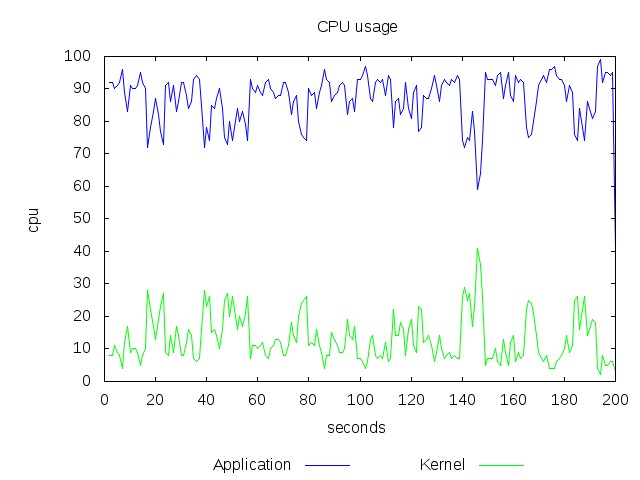
This graph might not be impressive because it deals with only numbers ranging from 0-100 and the numbers are very steady. Consider a range 0-99999999 and the numbers are fluctuating too much then it will be to graph. The above graph was created by running “gnuplot” with following commands
[shell]
set title ‘CPU usage’
#set terminal svg butt enhanced dynamic
set terminal jpeg
set output ‘output.jpg’
set xlabel ‘seconds’
#set logscale y
set ylabel ‘cpu’
set key below
plot \
“stat.txt” using :13 title ‘Application’ with lines lc rgb ‘blue’, \
“stat.txt” using :14 title ‘Kernel’ with lines lc rgb ‘green’
[/shell]
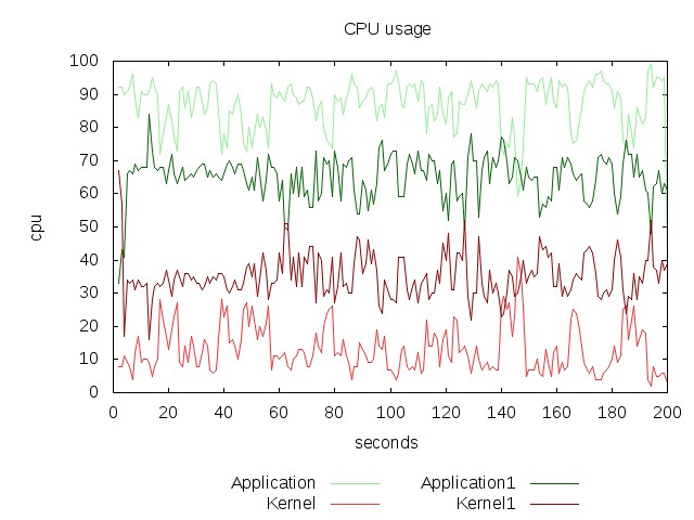
You can also intermix two or more data files. The following example shows how to graph two different samples collected during different time period.
[shell]
set title ‘CPU usage’
#set terminal svg butt enhanced dynamic
set terminal jpeg
set output ‘output.jpg’
set xlabel ‘seconds’
#set logscale y
set ylabel ‘cpu’
set key below
plot \
“stat.txt” using :13 title ‘Application’ with lines lc rgb ‘light-green’, \
“stat.txt” using :14 title ‘Kernel’ with lines lc rgb ‘light-red’, \
“stat1.txt” using :13 title ‘Application1’ with lines lc rgb ‘dark-green’, \
“stat1.txt” using :14 title ‘Kernel1’ with lines lc rgb ‘dark-red’
[/shell]
The stat1.txt file is generated by running vmstat while the system was stressed by the following command
[shell]stress –cpu 4 –io 2 –vm 4 –vm-bytes 1M –hdd 2 –hdd-bytes 4096 –timeout 200s[/shell]
The nice thing about gnuplot is it will skip the row(line) in the data file if it cant recognize the columns. And also it supports svg and pdf outputs. See what all gnuplot can do at the official demo page.